European Logo / Banner

Status
Not open for further replies.
Hey nintendstroid,

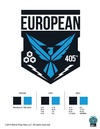
hope it's not too late for my feedback on the logo.

I like the shape of the logo itself and of the eagle. But I'm concerned about the size of the "405th", which in my opinion should be a main part of the logo. One main object is to express the affiliation with the 405th. But if you watch the logo from distance, that part is not recognizable any more, while the EUROPEAN is huge.

Also someone pointed out, that the logo won't work on dark backgrounds, e.g. my black armor. So you might suggest an outlined or negative alternative of the logo. That would be great!

Cheers
Kai alias eskayp
 
At least we don't have a N missing like the Aussies :D
I like the Logo. Some things could be better and more european but I can see myself putting this on my suit an be proud of it!
 
Some things could be better and more european

I'll follow this. I don't recall an eagle being a core component of the European flag, nor am I entirely sure where the lightning bolts are coming from.

How did we go from this:

flag_yellow_low.jpg


To this:

Av57AEq.png


The mind boggles.
 

Attachments

  • Av57AEq.png
    Av57AEq.png
    87.9 KB · Views: 342
Hey,

i like it, it has an eagle, lightning, stars, the form someone wanted and nice colors.

I thought we would decide what logo we want, but this logo is nice.

With a white/grey line around it can also be printed on dark things.

I know how much work it is to run a community, so i´m just happy that we have a logo now.
I don´t care if we were able to choose everything or were be involved in every step.
But i understand that some are dissapointed that they were not asked about it until it was finished.

After some years there will be more system in all of those processes, then less dissapointments ;)
 
I don´t care if we were able to choose everything or were be involved in every step.

I don't mean to start an argument with you, but this sort of outlook is how these sorts of problems begin in the first place.

I really don't mind the look of the new logo, in and of itself. What's got me fired up is that this was meant to be a community project, and that the ability to choose our own colours was taken away.
 
Hey,

yeah we weren´t able to choose anything for the final logo, we just could give some input of our vision of the logo before it was made. And i see they put a lot of our ideas in the new logo.

So yes, next time would be nice to know before how the whole process works, but now it is done. Fighting (Crying) won´t help to make anything better. ;)
 
Now that the design phase is complete, Asgardianhammer is hard at work, creating identity guides for you that will have variations of the logo, much like you see in the Division Identity guide so that the logo can be used on different color backgrounds and in different applications. Shouldn't be too terribly long before those are released.

Hey,

i like it, it has an eagle, lightning, stars, the form someone wanted and nice colors.

I thought we would decide what logo we want, but this logo is nice.

With a white/grey line around it can also be printed on dark things.

I know how much work it is to run a community, so i´m just happy that we have a logo now.
I don´t care if we were able to choose everything or were be involved in every step.
But i understand that some are dissapointed that they were not asked about it until it was finished.

After some years there will be more system in all of those processes, then less dissapointments ;)
 
Last edited:
It looks cool, even if it's not 100% what we wanted and lacks the stars but I can identify with it. Somebody worked hard at it so we shouldn't only write bad stuff about it but be thankful the whole Division has logos now that speak the same design language.
 
There seems to have been some miscommunication about the logo submisison.
This all because we are quite a fresh and new group.
The logo that we have before us now has taken stuff we have submitted in this thread as insipiration and got formed into one identity with the rest of the 405th.
Some things where just not compatible as i can gather.

We (me and my XO ) got to see the logo a bit earlier last week.
We decided that it looke pretty good and aplauded Asgardianhammer for all his work and effort he put into it.

I hope you can stand behind me and the XO's choice to be content with the logo that fits all of the 405th and its identity
You guys apointed me and Wayne for a reason right.
Hope you guys can stand behind us on this.
 
Last edited by a moderator:
To be honest I recently viewed the logos and banners and I have to say I *LOVE* the European logo.
The best one and I can't get enough of how COOL it is :D

Av57AEq.png

I was just curious, does anyone of the European 405ths wear it on the armor and represent 405th?
 
Hey,

on photos i often don´t see it also but i know from the meetings everybody has one somewhere :D Perhaps we should put it all on the same spot? If possible.
 
Status
Not open for further replies.
Back
Top