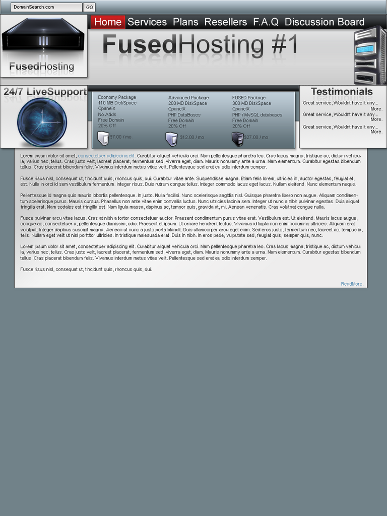
workin on my hosting site (template)

Status
Not open for further replies.

euro pholic

Jr Member
what do you think.

obviously its scaled down, so details arent that good.

fusedhostingcopy.png
 
It looks like one of those sites you download from freetemplate websites.

I think I've seen it before.

If not then its okay, a bit plain in the bottom.
 
Its not bad, but your hosting space is tiny. Im spending 7 dollars a month for 500 gig.

I dont mean to be rude
 
How long have you been designing for?

Honestly, I do not like it at all. Reason being, it seems to be all over the place, not organised. And the nav bar, doesnt even seem to be a nav bar. Everything is to cramped. Although, i do like the way you have tried to create a sense of "layering". This sometimes can work, but it hasnt in this case. You have to many "layers". It just seems unfinished and unprofessional.

Look around, get some inspiration, and, practise, practise, practise!
 
Status
Not open for further replies.
Back
Top