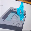
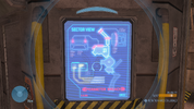
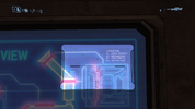
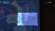
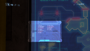
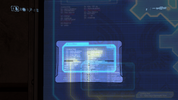
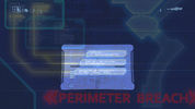
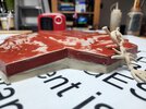
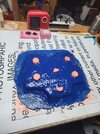
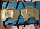
Wow! Those look incredible
pipninja
Some notes, because I'm a nitpicker and did more than my fair share of copy editing...
A couple minor typos ~
The first graphic:
•Management* in the second line
•Access* in the third
•Administrators* in the fifth
The Sector View final graphic:
•Terrible* in the S5 row of Sub's... blurb?
•Capitalize 'home,' also in row S5 - currently inconsistent with how you capitalized all of the other bracketed text
•Capitalize 'ideas' - since Terrible Ideas is the name of the division
In the "Armor" section of our motto:
•Cut the word 'every' - seems like a leftover from a rewording
•Costumes* in the same section
All very minor - Only ones I could find.
Would it be too weird to swap the placement of Honor and Unity so it matches the order of our motto? You're the one doing it - maybe you already tried and it didn't work?
Also centering the words (Honor, Armor, Unity) with the text inside the box - as is it almost looks like they were supposed to be snapped to the bottom of the text but they aren't, and it seems that you have enough space there to just center everything? (X axis, if that makes sense...) I get it looks like you were trying to use that corner wedge to align the 'Honor, Armor, Unity' bit, but I don't think that is actually necessary - Just move it to the right a smidge and center everything to the height of the whole text box.
Really these look phenomenal, Pip - Amazing job.

